


The Lessons in Absolute Immortality from the Coca-Cola Playbook
In the volatile landscape of global commerce, brands are born, hyped, disrupted, and forgotten within the span of a single decade. True immortality is a rare commodity. Yet, for over 130 years, a singular entity has maintained an iron-clad grip on the global consciousness without ever altering its core identity: Coca-Cola.
Coca-Cola is the ultimate proof of our Classiq philosophy: trends fade, but an intentional foundation is entirely immortal. By analyzing how this beverage giant dominates culture, luxury founders and operational architects can extract powerful pillars of brand longevity.
Pillar 1: The 100-Year Consistency (Defying the Impulse to Rebrand)
The greatest trap for any brand, creator, or entrepreneur is the temptation to constantly change to chase the newest crowd. When sales fluctuate, the amateur instinct is to panic, rewrite the logo, and alter the visual architecture.
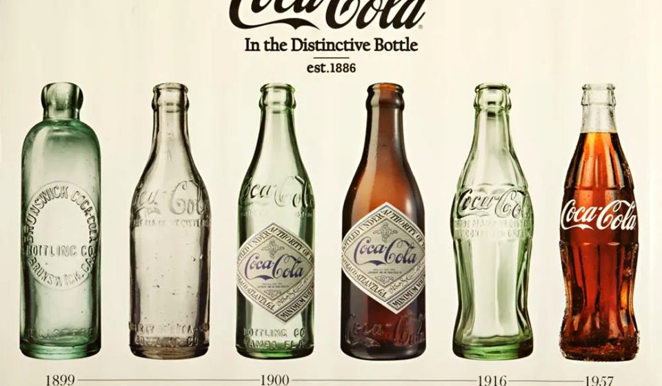
Coca-Cola treats its history like a sacred archive. The Spencerian script logo, penned in 1886, remains fundamentally unchanged. While tech giants and automotive houses redesign their aesthetics every five years to look “modern,” Coke understands that historical equity beats temporary trends every single time.
The Lesson: True security means building an unshakeable foundation that defies market turmoil. When you possess total confidence in your brand identity, you do not adapt to the world. The world adapts to your consistency.
Pillar 2: Tactile Sovereignty (The 2026 World Cup Collectible Ecosystem)
Most corporate sponsors approach massive events like the World Cup by throwing millions into standard TV commercials or slapping their logo onto generic billboards. For the 2026 tournament, Coca-Cola did something profoundly different: they turned the physical product into a cultural artifact.
Instead of standard promotional labels, they executed an elite masterclass in tactile product ecosystem design:
- The Spherical Form: They introduced limited-edition, structurally engineered football-shaped bottles, completely transforming the sensory experience of holding the product.
- The Hidden Archive: Partnering with Panini America, they hid exclusive, highly collectible World Cup player stickers directly behind the peel-back labels of their bottles.
- The Global System: They launched a unified visual packaging system designed by GOLDEN that integrates the national colors and player imagery of 48 distinct participating nations into the classic red can.

Traditional Marketing: [Create a Campaign] ─> “Please look at our product.”
Classiq Marketing: [Create an Artifact] ─> “You must collect this piece of history.”
By shifting the consumer mindset from “buying a beverage” to “collecting a piece of history,” they proved that packaging should never just be a container—it should be a piece of fan culture.
Pillar 3: The Luxury of Red & White (The High-Fashion Canvas)
A brand achieves absolute sovereignty when its core assets transcend their original retail category. Coca-Cola has seamlessly moved from the grocery shelf into the high-end streetwear sub-culture.
Look no further than their massive summer adidas Originals x Coca-Cola 2026 World Cup collection. Fronted by soccer’s ultimate prodigy, Lamine Yamal, the luxury lifestyle collection breathes new life into classic 2000s silhouettes. The design features subtle droplet details mimicking cold soda cans, alongside vintage retro advertising mashed seamlessly into premium track jackets and jerseys.
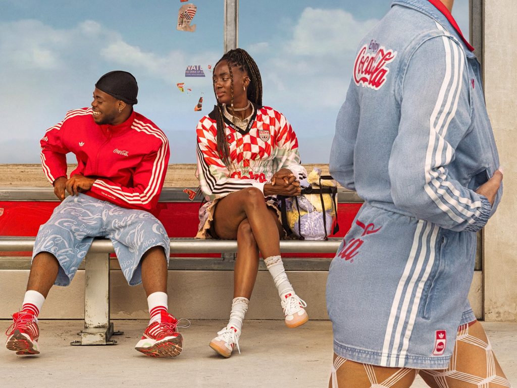
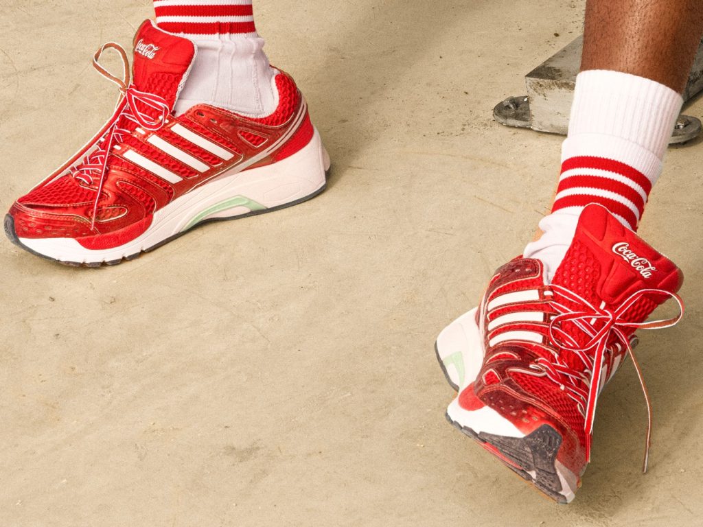
Coke doesn’t need to produce apparel themselves. Their visual equity—the specific hue of red, the flowing white script—is so universally powerful that legacy fashion houses happily use it as a premium design canvas.